
Friday, December 20, 2013
Monday, December 9, 2013

Friday, December 6, 2013
Thursday, November 21, 2013
Research
Product
Packaging
This is a
research report to prepare for your next assignment as a designer. You will review existing product packaging
for it’s values and answer the questions for each product. You must evaluate the packaging on 4
products. 2 Food and 2 Clothing.
Define
Product Packaging:
Wikipedia
gives 9 purposes for product packaging.
What are they?
1) Physical protection
2) Barrier protection
3) Containment or agglomeration
4) Information transmission
2) Barrier protection
3) Containment or agglomeration
4) Information transmission
5) Marketing
6) Security
7) Anti-counterfeiting Packaging
8) Convenience
9) Portion control
6) Security
7) Anti-counterfeiting Packaging
8) Convenience
9) Portion control
Rules of Product Packaging
1. Clarity and simplicity
2. Honesty
3. Authenticity (how are you memorable?)
4. Shelf Impact ( shopper impulse )
5. Extensibility ( Can the design be applied to various
flavors or packaging )
6. Practicality
Research
and Evaluation
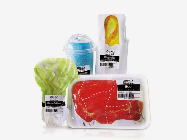
Food Product
#1

1) Name of the product: Swell
2) Picture of the Product
3) What is the focus of the product packaging? For surfers.
4) What do you like most about the packaging? The cool design, and it’s simple.
5) What do you like least about the packaging? It looks a little too vintage for the target audience.
6) List items on the package, list all! {ie: Ingredients, barcode, picture, Slogan} etc. Picture of a wave, logo, “surf fuel”, ingredients.
7) What kind of packaging does it have? It’s in a bag/box.
8) How many sides of the container are covered with information? All of them.
9) Does it have a repeated pattern anywhere on the package? Yes
10) Why would you pick this product/package over its competitor? It’s unique and cool looking.
11) What age is the audience of this product package? Older teens to adults.
Food Product
#2
1) Name of
the product: Sweet Time
2) Picture of the Product (Paste here)
3) What is the focus of the product packaging? Tea!
2) Picture of the Product (Paste here)
3) What is the focus of the product packaging? Tea!
 4) What do you like most about the packaging?
Everything
4) What do you like most about the packaging?
Everything 5) What do you like least about the packaging? Nothing.
6) List items on the package, list all! {ie: Ingredients, barcode, picture, Slogan} etc. Ingredients, the temp. the water should be.
7) What kind of packaging does it have? Box and then little tea thing in it.
8) How many sides of the container are covered with information? 2/4
9) Does it have a repeated pattern anywhere on the package? Yes, maybe.
10) Why would you pick this product/package over its competitor? It gives you a cube of sugar….. it’s really cute.
11) What age is the audience of this product package? Teens and adults who love tea.
Clothing
Product #1
1) Name of
the product: Milli Shoe
 3) What is the focus of the product packaging? Shooooes
 4) What do you like most about the product packaging? It looks like a bullet
5) What do you like least about the product packaging?
6) List items on the package.
7) What kind of packaging does it have? Bullet shape…. Metal????
8) How many sides of the container are covered with information? Barcode at the bottom. Logo on the cylinder side
9) Does it have a repeated pattern anywhere on the product packaging? It’s a bullet….
10) Does it have a slogan or a motivational saying? If so, type it out. NO.
11) Why do they have a slogan or motivation saying? Well the name is milli, short for millisecond fOOt rAcE????
12) Why would you pick this product packaging over its competitor? Bullet.
13) What age is the audience of this product packaging? Track runners 13-38

3) What is the focus of the product packaging? Clothes that look like food.
4) What do you like most about the product packaging? It’s really creative like it’s clothes THAT LOOKS LIKE FOOD
5) What do you like least about the product packaging? Nothing
6) List items on the package.
7) What kind of packaging does it have? Depends on what food you get.
8) How many sides of the container are covered with information? The front.
9) Does it have a repeated pattern anywhere on the product packaging? no.
11) Why do they have a slogan or motivation saying? No
12) Why would you pick this product packaging over its competitor? Food
13) What age is the audience of this product packaging? Cool people.
Friday, November 15, 2013


Tuesday, November 12, 2013

Friday, November 8, 2013
Tuesday, November 5, 2013
Questionnaire
Branding and Identification
Questionnaire: Personal Graphic Design
Company
General company information:
*Company Name (Fill this in) Feral
Studios
What product
or service does your business offer? Graphic Design. Illustration for various companies and
products.
Who (age/gender) is your target audience and who
is your most ideal customer (economic status/education etc) ? Anyone.
How would you describe your services and/or products? Logos, Websites, Printed design, t-shirts,
etc.
Who are your
competitors and how do you differ from them?
Other graphic designers.
Please
provide general information about your business. (Fill this in) My business makes and designs logos.
What is the overall mood of the
company? Serious about creating a good product, but open to creative input.
Logo information:
Your logo will be used in print, website, video media. (keep this in mind) SIMPLE, MEMORABLE, SCALEABLE
Fill in ALL questions below
If you want your company name to appear in the logo, what is
the exact name as you would like it to appear in your logo? Feral.
What is the overall message you wish to portray (serious,
playful, etc)? It can be serious but it knows how to party.
Do you have any color preferences? No.
What feeling or message do you want your logo to convey to
those who view it? A nice one.
Do you envision something techy (squarish, modern) or more
organic (natural, soft, roundish)? I envision something techy.
Thursday, October 31, 2013
Monday, October 28, 2013

Wednesday, October 23, 2013

Tuesday, October 15, 2013

Friday, October 11, 2013

Wednesday, October 2, 2013

At first I didn't know how to do this and then I made the background black to show the word "darkness". And also as you can see I made the word "darkness" a darker color to show that when people say "the dark time in my life" they mean like the bad and the grey looking color makes it look more sad and depressed. The important words that are bigger are "darkness" and "color". The word "colors", rather than being all colorful I just made simple lines behind the word so it does not take away from the seriousness from the quote.
Color theory worksheet
Color Theory Worksheet
Please read the materials listed below and answer the
following questions:
• Color
Theory Intro: http://www.nhsdesigns.com/graphic/color/index.php
• Color
Wheel: http://www.nhsdesigns.com/graphic/color/color-wheel.php
• Color
Combinations: http://www.nhsdesigns.com/graphic/color/color-combos.php
• Tints,
Shades & Neutrals: http://www.nhsdesigns.com/graphic/color/tints_shades_neutrals.php
• Emotional
Content: http://www.nhsdesigns.com/graphic/color/emotional-content.php
• Color
Meaning: http://www.color-wheel-pro.com/color-meaning.html
• Color
Physiology:
http://www.webdesign.org/web-design-basics/color-theory/color-psychology-quick-reference-cards.13826.html
Please type out answers in complete sentences. You may paraphrase. Please do NOT copy and paste definitions.
1. Define hue:
Hue is what tells one color apart from another.
2. Define
value: Value is the lightness or darkness of a color. It is also called tone.
3. Define
saturation: Saturation is the brightness of a color. It is also known as
Chroma.
4. How many
colors are available on our computers? There are millions of colors.
5. Define
secondary color: Secondary colors are two primary colors mixed together.
6. Define
tertiary color: Tertiary colors are a primary and a color right next to it
together.
7. Define
complementary colors: They are 2 colors that are opposite of each other.
8. What are
the primary colors in Photoshop? They are red, green, and blue.
9. What are
the secondary colors in Photoshop? They are cyan, magenta, and yellow.
10. Define
subtractive color model: This is where you mix the primary colors of Photoshop
together.
11. Define
additive color model: This is where you mix the primary colors of a normal
color wheel together.
12. Is RGB
additive or subtractive? It is additive.
13. Is CMYK
additive or subtractive? It is subtractive.
14. What is the
RGB color model used for? It is used for the way light mixes on a computer
screen.
15. What is the
CMYK color model used for? It is used for printing.
16. Define analogous
colors: They are colors that sit next to each other.
17. Define tint:
Tint is where white is added to a color.
18. Define
shade: Shade is where black is added to a color.
19. Define
neutral: Neutral is a combination is complementary colors.
20. What can be
said in general about warm colors? They tend to pop out of a design.
21. What can be
said in general about cool colors? They tend to recede in a design.
22. What color
is associated with stability? Purple and Blue are colors of stability.
23. What color
symbolizes royalty? Purple is also associated with royalty.
24. What is the
color of cleanliness? Blue and white are colors of cleanliness.
25. What color
symbolizes freshness? Green symbolizes freshness.
26. Which colors
are associated with joy? Yellow and orange are associated with joy.
27. What color
symbolizes passion and danger? Red symbolizes passion and danger.
28. Dark red is
associated with: It is associated with vigor, willpower, rage, anger,
leadership,courage, longing, malice, and wrath. Color Theory Worksheet
Please read the materials listed below and answer the
following questions:
• Color
Theory Intro: http://www.nhsdesigns.com/graphic/color/index.php
• Color
Wheel: http://www.nhsdesigns.com/graphic/color/color-wheel.php
• Color
Combinations: http://www.nhsdesigns.com/graphic/color/color-combos.php
• Tints, Shades & Neutrals:
http://www.nhsdesigns.com/graphic/color/tints_shades_neutrals.php
• Emotional
Content: http://www.nhsdesigns.com/graphic/color/emotional-content.php
• Color
Meaning: http://www.color-wheel-pro.com/color-meaning.html
• Color
Physiology:
http://www.webdesign.org/web-design-basics/color-theory/color-psychology-quick-reference-cards.13826.html
Please type out answers in complete sentences. You may paraphrase. Please do NOT copy and paste definitions.
Monday, September 30, 2013

Thursday, September 26, 2013

Tuesday, September 24, 2013

Monday, September 23, 2013
Glyph monster/thing

This is my TARDIS made out of glyphs. And there is Tim, I made him when I got frustrated one day. There was many things that I had to overcome like: when Ms. Klein said it needed to be more glyph-y. So, this was very tedious. Also there is a picture that I based my glyph-y thing with.

Monday, September 16, 2013
Typography Worksheet
Typography Worksheet: Use the links below to complete the
worksheet.
Write out the answers to these questions in complete
sentences.
Label and define all of the above numbers:
1. Ascender line is a stroke from a letter which rises above
the mean line.
2. The base line is the imaginary line on which all characters rest.
3. Ascender height is the x-height plus the height of the ascending stroke.
4. Cap height is the height of capital letters
5. Descender is the stroke of s letter which dips below the base line.
6. Ascender is the stroke of a letter which rises above the mean line.
7. X-height is the distance between the flat top and bottom of a letter that does not have a descender or ascender.
8. Cap line- the imaginary line which determines the height of capital letters.
9. Mean line- imaginary line that determines the height of the lower case letters.
10. Descender line- the imaginary line which defines the bottom reach of descenders.
Define Serif: a typeface that has projecting features.
Define Sans-Serif: a typeface that does not have projecting features.
When do you use Antique Fonts? They have a long history; can be used to evoke a period feel.
At most how many words should be Decorative Fonts at a time? Three.
What does a script font resemble? Quill pen and that mimic modern styles of handwriting.
Why use Symbol Fonts?
Define Typography: Making the letters look pretty….
Why do designers need a solid foundation in typography? Because it will make you more effective in making an underlying message in a work congaing words.
Kerning: the space between letters in a word.
Leading: is the space between the lines of text.
Tracking is the creation of “rivers” in a work, or the white space throughout the whole text.
When do you use Center Alignment? When a person wants to draw attention (used in newspapers, book titles, etc.).
When do you use Right Alignment? When a person wants to be more professional (business cards, return address labels).
When do you use Justified Alignment? Basically in textbooks and it also makes the perfect alignment when talking about margins.
What is remembered, good styling, and bad styling? Why? Bad
styling is more remembered, because it just looks bad and it makes you laugh
about it.
What is legibility? Basically means can a person read it.
Type size smaller than 7pt is: 5pt
Type size smaller than 3pts is: 2pt
Type range for legible type is: 8pt to 14pt
What size do you use for long passages? 8pt to 14pt
What case do we use for Body? Upper and lower case.
What is measure? The width of the text column.
What can you tell me about Ranged/Ragged Edges? Ranged is aligned to the left hand margin, and ragged is to the right and is mostly used with short text.
What are some ways text can be used as images? Summarize
what you see.
A picture can be made from words. Words can be warped to fit
around pictures or other texts.
**Read ALL of it.
Answer the following:
Why is choosing and using the right font important? Your
opinion.
I think that when you choose the right font it really shows
your personality ,but showing your personality isn’t always a good thing, so
just makes sure people can read it.
What are the two most important things to remember? Type is
on the page to serve the text. Type should not overpower text. There are no
good or bad typefaces.
What is appropriate? What do you have to consider? You
should consider who you are sending the work to. Don’t make serious things not
serious because
Tell me the rules: (there
are 10)
1.
Body should be 10 to 12 w/ 11 point, use the
same typeface throughout the body.
2.
Use enough line space; always add at least 1 or
2 points to the type size, like in the title.
3.
Don’t make your lines to short
4.
Make paragraph beginnings clear (indent).
5.
Use one space after a sentence.
6.
Don’t justify text unless it is necessary.
7.
Don’t underline anything
8.
Use italics instead of underlining
9.
Don’t use long lines in italics, bold, or in all
caps.
10.
Leave space above headlines and subheads then
below them, avoid headlines in all caps.
Friday, September 13, 2013

Thursday, September 5, 2013

Wednesday, September 4, 2013

Monday, September 2, 2013

Wednesday, August 28, 2013
Line:
-A fundamental mark or stroke. Two connected points form a line. It doesn't hasn't have to be straight.
Color:
- Comes from light.
Attributes:
- Hue
-values and tints and shades
-saturation gives color brightness or dullness
Shape:
- an area that stands out from the space next to or around it due to a defined or implied boundary.
Categories:
- Geometric shapes
- Organic Shapes, informal or irregular
- Positive and negative shapes
- Static shape, appears to be resting or still
- Dynamic shape, it appears to be moving.
Texture:
- how a surface feels or looks. Tactile texture is the actual feeling, visual texture is the illusion of the actual texture.
Space:
-Space is the depth of an area. You can make a two dimensional by creating of of a three-dimensional. (i.e. overlapping objects, shading, highlights, etc.)
Form:
- any three dimensional object. You can measure form with height, width, and depth, also with shading.
Subscribe to:
Comments (Atom)